Commons:Featured picture candidates/File:Ganymede diagram.svg
Jump to navigation
Jump to search

File:Ganymede diagram.svg, featured
[edit]
Voting period is over. Please don't add any new votes.Voting period ends on 11 Mar 2014 at 03:54:33 (UTC)
Visit the nomination page to add or modify image notes.

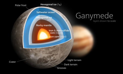
 Info Diagram of Jupiter's moon Ganymede. All by Kelvinsong—Love, Kelvinsong talk 03:54, 2 March 2014 (UTC)
 Support—Love, Kelvinsong talk 03:54, 2 March 2014 (UTC)
 Comment What is ice-six and how does that relate to tetragonal crystals? Why is the normal ice annotated as 1h? Is groves a scientific term? Shouldn't ganymede be Ganymede given it is a proper name? Saffron Blaze (talk) 04:32, 2 March 2014 (UTC)
- There's literally like 15 kinds of ice in the universe, including Ice six & Ice one-h. Ice six for whatever reason has tetragonal crystals, Ice 1h is the snowflake-kind we all know and love (the h stands for hexagonal crystals). Take a look at the w:Ice article. I didn't note "hexagonal crystals" cause everyone knows normal ice is hexagonal. Idk if grooves is a scientific term but that's what the wikipedia Ganymede article uses. && I usually don't capitalize headings, it's stylistic.—Love, Kelvinsong talk 05:10, 2 March 2014 (UTC)
- Interesting stuff. In reading that I would suggest you clean up how you present the ice information. In one you use the official ice designation first yet in the other it is bracketed. I get you are assuming people know normal ice is hexagonal but I am certain you are mistaken. I would suggest naming the layers after their shape (hexagonal and tetragonal) and bracketing the official name (Ice 1h and Ice VI) for consitency. Saffron Blaze (talk) 16:28, 2 March 2014 (UTC)
 Done—Love, Kelvinsong talk 18:01, 2 March 2014 (UTC)
- Interesting stuff. In reading that I would suggest you clean up how you present the ice information. In one you use the official ice designation first yet in the other it is bracketed. I get you are assuming people know normal ice is hexagonal but I am certain you are mistaken. I would suggest naming the layers after their shape (hexagonal and tetragonal) and bracketing the official name (Ice 1h and Ice VI) for consitency. Saffron Blaze (talk) 16:28, 2 March 2014 (UTC)
- There's literally like 15 kinds of ice in the universe, including Ice six & Ice one-h. Ice six for whatever reason has tetragonal crystals, Ice 1h is the snowflake-kind we all know and love (the h stands for hexagonal crystals). Take a look at the w:Ice article. I didn't note "hexagonal crystals" cause everyone knows normal ice is hexagonal. Idk if grooves is a scientific term but that's what the wikipedia Ganymede article uses. && I usually don't capitalize headings, it's stylistic.—Love, Kelvinsong talk 05:10, 2 March 2014 (UTC)
 Oppose "Ganymede" text looks nicer when bolded. Not visually pleasing enough.
- Support Better now. Interesting graphics and good information as well. (✉→Arctic Kangaroo←✎) 08:30, 9 March 2014 (UTC)
- (Edit conflict) Why has everyone suddenly been on a capitals crusade lately… I've never capitalized a title on any of my pictures before. Headings don't have to follow the same rules that body text has to. Even the Wikimedia grants page drops the capitals. && I should also note that the Wikivoyage logo is set in all lowercase too.—Love, Kelvinsong talk 15:55, 2 March 2014 (UTC)
- This is why: https://en.wikipedia.org/wiki/Wikipedia:Manual_of_Style/Capital_letters#Celestial_bodies Saffron Blaze (talk) 15:58, 2 March 2014 (UTC)
- @ Saffron Note: Wikipedia and Commons are unrelated. (✉→Arctic Kangaroo←✎) 16:11, 2 March 2014 (UTC)
- Wrong. Perhaps you should read what is considered in scope. Saffron Blaze (talk) 16:22, 2 March 2014 (UTC)
- @Kelvinsong: Initially I thought something was wrong without capitals. But when I saw all your other graphics afterwards I decided to revert my decision. NO CAPS is better in this situation.
 (✉→Arctic Kangaroo←✎) 16:11, 2 March 2014 (UTC)
- Wong again. This image should be suitable for use on en:WP as it is in English. The MOS indicates capitals for celestial bodies as a proper name. This convention is not limited to Wikipedia. Saffron Blaze (talk) 16:22, 2 March 2014 (UTC)
- Done This isn't worth fighting over. I capitalized the g. Been trying to move away from that Windows 8 style anyway.—Love, Kelvinsong talk 18:09, 2 March 2014 (UTC)
- @Kelvinsong: Hmm...why is the text unbolded. I'm afraid I will change my vote if the issue is not fixed soon. (✉→Arctic Kangaroo←✎) 11:39, 3 March 2014 (UTC)
- Why?¿ Larger text is generally supposed to take a lighter fontweight & we are rapidly moving into the iOS 7 age where bold text is so last year—Love, Kelvinsong talk 00:42, 7 March 2014 (UTC)
- Comparing it to your other graphics of the Sun, Earth, Moon, etc, the bold text is nicer. And well, I don't really bother whether it's the iOS 7 age or not, as long as Macs don't rule the world (and Windows does). I'm changing the vote to oppose, but you can (of course) choose whether it should remain unbolded or not. Cheers. ;) (✉→Arctic Kangaroo←✎) 07:00, 8 March 2014 (UTC)
- Display type is almost always thinner and more delicate than body type, but in the intrest of avoiding conflict I bolded the Ganymede text one level to 25. && What's wrong with Apple? They're far ahead of Windows when it comes to design. (but ofc Ubuntu beats them all bc you can customize it to whatever you likee)—Love, Kelvinsong talk 18:08, 8 March 2014 (UTC)
- Ah...better now. I'm not sure what's Ubuntu, but I have nothing against Apple, except the damn Macs and iPods. (✉→Arctic Kangaroo←✎) 08:30, 9 March 2014 (UTC)
- Display type is almost always thinner and more delicate than body type, but in the intrest of avoiding conflict I bolded the Ganymede text one level to 25. && What's wrong with Apple? They're far ahead of Windows when it comes to design. (but ofc Ubuntu beats them all bc you can customize it to whatever you likee)—Love, Kelvinsong talk 18:08, 8 March 2014 (UTC)
- Comparing it to your other graphics of the Sun, Earth, Moon, etc, the bold text is nicer. And well, I don't really bother whether it's the iOS 7 age or not, as long as Macs don't rule the world (and Windows does). I'm changing the vote to oppose, but you can (of course) choose whether it should remain unbolded or not. Cheers. ;) (✉→Arctic Kangaroo←✎) 07:00, 8 March 2014 (UTC)
- Why?¿ Larger text is generally supposed to take a lighter fontweight & we are rapidly moving into the iOS 7 age where bold text is so last year—Love, Kelvinsong talk 00:42, 7 March 2014 (UTC)
- @Kelvinsong: Hmm...why is the text unbolded. I'm afraid I will change my vote if the issue is not fixed soon. (✉→Arctic Kangaroo←✎) 11:39, 3 March 2014 (UTC)
- @ Saffron Note: Wikipedia and Commons are unrelated. (✉→Arctic Kangaroo←✎) 16:11, 2 March 2014 (UTC)
- This is why: https://en.wikipedia.org/wiki/Wikipedia:Manual_of_Style/Capital_letters#Celestial_bodies Saffron Blaze (talk) 15:58, 2 March 2014 (UTC)
- (Edit conflict) Why has everyone suddenly been on a capitals crusade lately… I've never capitalized a title on any of my pictures before. Headings don't have to follow the same rules that body text has to. Even the Wikimedia grants page drops the capitals. && I should also note that the Wikivoyage logo is set in all lowercase too.—Love, Kelvinsong talk 15:55, 2 March 2014 (UTC)
- Support I'd be a monumental ass if I didn't support now :-) Interesting image. I was drawn to immediately and it made me want to learn more. Saffron Blaze (talk) 18:13, 2 March 2014 (UTC)
- Thanksss!!—Love, Kelvinsong talk 19:50, 2 March 2014 (UTC)
- @Kelvinsong: Me too...astronomy is great stuff. I have been interested in it for a long time. :) (✉→Arctic Kangaroo←✎) 11:40, 3 March 2014 (UTC)
- Thanksss!!—Love, Kelvinsong talk 19:50, 2 March 2014 (UTC)
- Support — Julian H.✈ (talk/files) 18:24, 2 March 2014 (UTC)
- Support Christian Ferrer (talk) 19:30, 2 March 2014 (UTC)
- Support per above --Martin Falbisoner (talk) 21:30, 2 March 2014 (UTC)
- Support Halavar (talk) 00:34, 4 March 2014 (UTC)
- Support —Blurred Lines 13:28, 4 March 2014 (UTC)
- Support A really attractive and informative diagram --Baresi franco (talk) 23:09, 7 March 2014 (UTC)
- Support -- Colin (talk) 10:36, 8 March 2014 (UTC)
- Support Michael Barera (talk) 04:27, 9 March 2014 (UTC)
Confirmed results:
Result: 11 support, 0 oppose, 0 neutral → featured. /(✉→Arctic Kangaroo←✎) 15:08, 9 March 2014 (UTC)
This image will be added to the FP gallery: Non-photographic media/Computer-generated