Commons:Featured picture candidates/File:Chloroplast division.svg
Jump to navigation
Jump to search

File:Chloroplast division.svg, not featured
[edit]
Voting period is over. Please don't add any new votes.Voting period ends on 11 Feb 2013 at 00:00:06 (UTC)
Visit the nomination page to add or modify image notes.

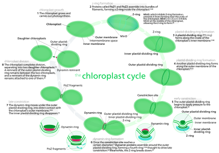
 Info Diagram of chloroplast division, with cited sources. Editable text is off-page. All by Kelvinsong—Kelvinsong (talk) 00:00, 2 February 2013 (UTC)
 Support — Kelvinsong (talk) 00:00, 2 February 2013 (UTC)
- Support Penyulap ☏ 03:52, 2 February 2013 (UTC)
- Support — High EV. However,
- The transparent background can be a problem on many of the non-English Wikipedias. On many of the non-English Wikipedias, containers such as thumbnails have a grayish background which show through your image and give it a dull appearance. For example, here is a link to your image in a thumbnail container on my sandbox on the German Wikipedia. The same applies to most of your other SVG images, many of which are very beautiful and high EV.
- There are a number of shaded rectangles that don't match the text in steps 1, 2, 3, 4, 8 which should be altered or removed.
- The image is not smartphone friendly. I don't have the statistics ready to cite, but a very large fraction of Wikipedia usage is via smartphone. It's OK on a standard tablet, but hard to read on a mini-tablet. In the future, try to remember the diversity of devices on which people will access your images.
- Going along the same lines, this is not a low-vision-friendly image, especially the light green lettering in the middle.
- Despite all of these reservations, I'm still giving my support, since I know that you will do your best to fix the issues, if not necessarily here, but certainly in your future productions!
- When I first started to illustrate for wikipedia, I put white backgrounds on everything, for the same exact reasons you mentioned. However, I read several guidelines that recommended that we use transparent backgrounds (and several complaints against another illustrator for using opaque backgrounds), so now I use transparent backgrounds for almost everything, reserving opaque ones for pictures that need fake alpha masking, as the mediawiki renderer doesn't support true SVG alpha masks, and space images, which take a black background. If it's that important, I could upload an opaque version, though I would rather not as I am trying to reduce "version proliferation" which makes it very difficult to issue updates and improvements. 1 language × 2 opacities = 2 versions isn't too bad, but think 2 opacities × (3 languages + 1 numbered) × 2 editable/ineditable versions × 2 titled/untitled = 32 versions to create, upload, interlink, and update.
- I own a smartphone, and I know all too well how frustrating web browsing can be on one. However, for this picture, the only way this would work is breaking open the circle and laying it in a linear sequence (ruining the "cycle" element). I am sorry, but it is hard enough to convert something three-dimensional to two-dimensions, going down to one dimension is simply too restrictive.
- That's a stylistic thing ;)
- The green text in the light font is simply a footnote, and I might even remove it—I'm not completely sure what the source meant about chloroplast DNA replication.
- Anyway, thanks for your support—Kelvinsong (talk) 19:33, 3 February 2013 (UTC)
- I'd be interested in reading the guidelines that you mention. Guidelines can be changed, although I know, from personal experience, that the MOS is maintained by a bunch of language lawyers who can be exceedingly intolerant of opposing points of view. By any chance can you point me to the proper subsection, chapter, verse of the vast, sprawling Manual of Style? Thanks!
- I understand, which is why I wasn't asking you to attempt the impossible. Stigmatella aurantiaca (talk) 20:41, 3 February 2013 (UTC)
- Anyway, thanks for your support—Kelvinsong (talk) 19:33, 3 February 2013 (UTC)
- After some searching, I finally managed to find it in Help:SVG, under the FAQ section. I also found that example of someone opposing an illustration for an opaque background, though it's on a FPC from 2007. I suppose that Help:SVG guideline should be taken with a grain of salt—it also says you shouldn't use Gaussian blurs because the renderer won't render them (Not true, the renderer is *very buggy* with the blur, but it renders them . . . sometimes.). Still, I think a better approach would be to be able to specify the background in the Thumbnail syntax, though you'd have to talk to the Mediawiki people to do that.—Kelvinsong (talk) 22:22, 3 February 2013 (UTC)
- "However, if your image really needs a specific colored background, create a rectangle the size of the image, fill it with the background color of your choice, and choose the command Object → Lower to Bottom." — That is what I regularly do for my own images, since several of them appear on the German and French Wikipedias, and the default grayish thumbnail backgrounds on those wikis really stink. For example: File:MMX with optical resonators DE.svg, File:MMX with optical resonators fr.svg. The various multiple image containers on the English Wikipedia have grayish backgrounds as well.
- I don't think that WarX was criticizing white versus transparent backgrounds. The image in question had a transparent background. I think, rather, that he meant that the image should have been cropped to have minimal margins. Another possible interpretation of his comments, maybe, is that he thought some other color than white would be preferable... who knows, mauve? Chartreuse? =)
- Being able to specify background color would be a nice feature. I'll try suggesting it. But the specific issue is that the different language wikis are apparently operating on different branches of the base code, and new features like the default white thumbnail backgrounds in the English Wikipedia haven't propagated to all of the other branches. Stigmatella aurantiaca (talk) 23:28, 3 February 2013 (UTC)
- After some searching, I finally managed to find it in Help:SVG, under the FAQ section. I also found that example of someone opposing an illustration for an opaque background, though it's on a FPC from 2007. I suppose that Help:SVG guideline should be taken with a grain of salt—it also says you shouldn't use Gaussian blurs because the renderer won't render them (Not true, the renderer is *very buggy* with the blur, but it renders them . . . sometimes.). Still, I think a better approach would be to be able to specify the background in the Thumbnail syntax, though you'd have to talk to the Mediawiki people to do that.—Kelvinsong (talk) 22:22, 3 February 2013 (UTC)
Confirmed results:
Result: 3 support, 0 oppose, 0 neutral → not featured. /A.Savin 00:09, 11 February 2013 (UTC)