Commons:Featured picture candidates/File:2017 Ballantine's Finest.jpg
Jump to navigation
Jump to search

Voting period is over. Please don't add any new votes.Voting period ends on 15 Feb 2017 at 18:10:54 (UTC)
Visit the nomination page to add or modify image notes.

- Category: Commons:Featured pictures/Objects
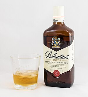
 Info All by me -- Jacek Halicki (talk) 18:10, 6 February 2017 (UTC)
 Support -- Jacek Halicki (talk) 18:10, 6 February 2017 (UTC)
 Oppose I'd love to see this on a darker background instead. As it is the top of the bottle has not enough separation from the background and the glass has the same problem. They both nearly dissolve into the gray background. – LucasT 18:14, 6 February 2017 (UTC)
- @Lucas: You probably have badly calibrated monitor, in my monitor clear difference. Look here. RGB values on the background is: 235, 235 and 235, and on he bottle is 238, 236 and 224. --Jacek Halicki (talk) 18:48, 6 February 2017 (UTC)
- @Jacek Halicki: I do see that color difference there, no worries. What I meant was that in general, a white background is not a good choice for a nearly white object to show in a product photograph, same with the glass, even if you are able to still see the boundary and the edge is in focus. (with the glass the back edge is not even in focus, making it worse). So while you call that a "clear difference", photographically it is far from ideal and in my view a darker background would help the image a lot, even for those with good vision and monitor ... – LucasT 19:40, 6 February 2017 (UTC)
- Oppose Regretfully, I have to agree with Lucas. This may be Fifty Shades of Grey(or White) but the whites are too close to each other to make it a wow-y photo, setting is also a bit pedestrian for me since there are so many cool things you can do with glasses and whisky. (And I did calibrate my monitor only yesterday.) Sorry. --cart-Talk 19:49, 6 February 2017 (UTC)
- Oppose Per Lucas. lNeverCry 21:37, 6 February 2017 (UTC)
- Oppose - As the person who promoted this to QI and nominated it for VI, I agree with the others. It's a very good photo, but to be an FP, it would need a more contrasting background. -- Ikan Kekek (talk) 22:54, 6 February 2017 (UTC)
- weak support Although I'd always stick to my Lagavulin and Laphroaig, from a photographic point of view all that criticism might be a bit over the top. While a black background could be interesting, sure, I'm fine with this straightforward product shot. As for the rather standard presentation/composition, however, Cart's right. --Martin Falbisoner (talk) 07:02, 7 February 2017 (UTC)
- Oppose The setting, showing whisky and a glass, with a white base/background is just weird. If it was just the bottle, then as a "on white" product shot, I could understand (though still hard to be wowed by an image I'd recognise from a Tesco online grocery shop, and I'd expect the background to be pure white and the base to not be paper). But if you pour a glass of whisky then you are making a scene where it is being drunk and enjoyed. Whisky should be photographed just like we would food photography -- with care to dress the table and background and arrange the ambient light so that one anticipates enjoying what one sees. For a glass whisky bottle, this is a classic opportunity to demonstrate some skill with back lighting to make the contents positively glow from within, like the liquid does when you drink it. I'm afraid this bottle has all the inner glow of a cough mixture from Boots and the glass all the appeal of the plastic cup my dentist offers me to rince my mouth. It isn't enough to expose and focus correctly. A great product shot should instill some desire. -- Colin (talk) 12:58, 7 February 2017 (UTC)
- Oppose--shizhao (talk) 13:39, 7 February 2017 (UTC)
- @Shizhao: you need to state a reason why you oppose, even if it is just a "per User" when you agree with User's remarks. – LucasT 14:59, 7 February 2017 (UTC)
 I withdraw my nomination --Jacek Halicki (talk) 14:34, 7 February 2017 (UTC)